RGB vs CMYK for Custom Playing Cards: Artwork File Guide for Printing
Last updated: July 30, 2026
Quick Answer
Use CMYK. If you send RGB files, we'll convert them — but the colors may shift unexpectedly. Designing in CMYK from the start gives you the most control over how your final cards look.
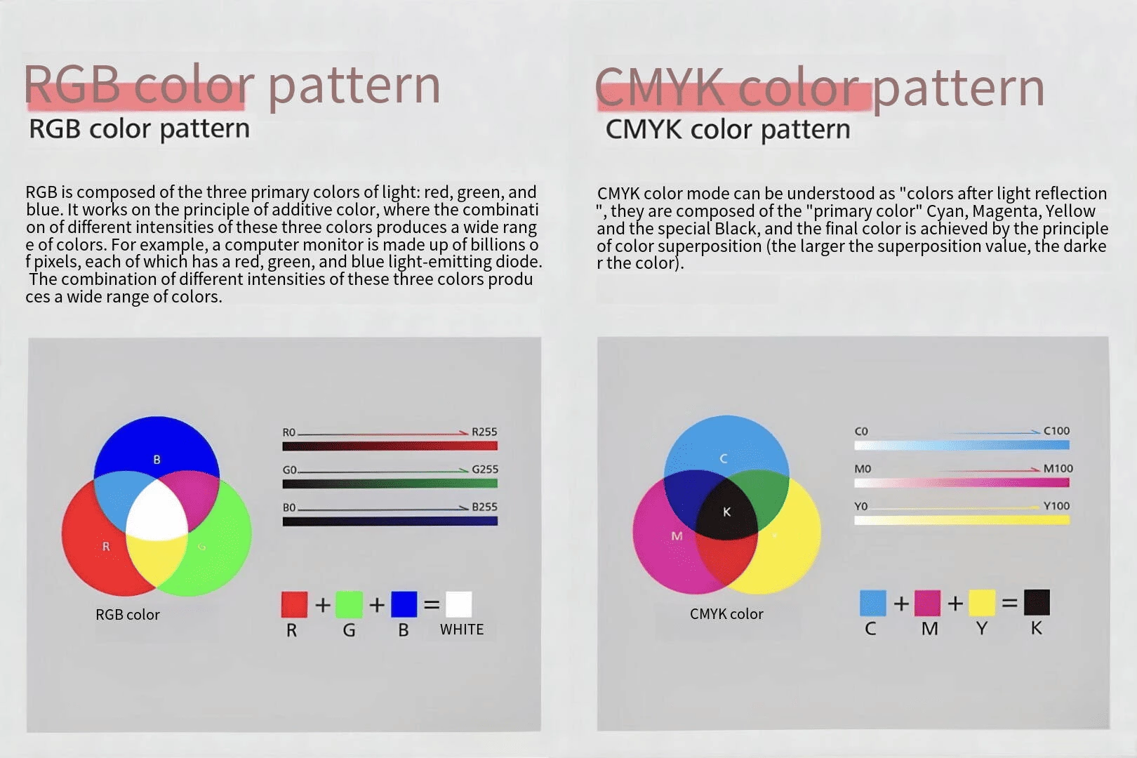
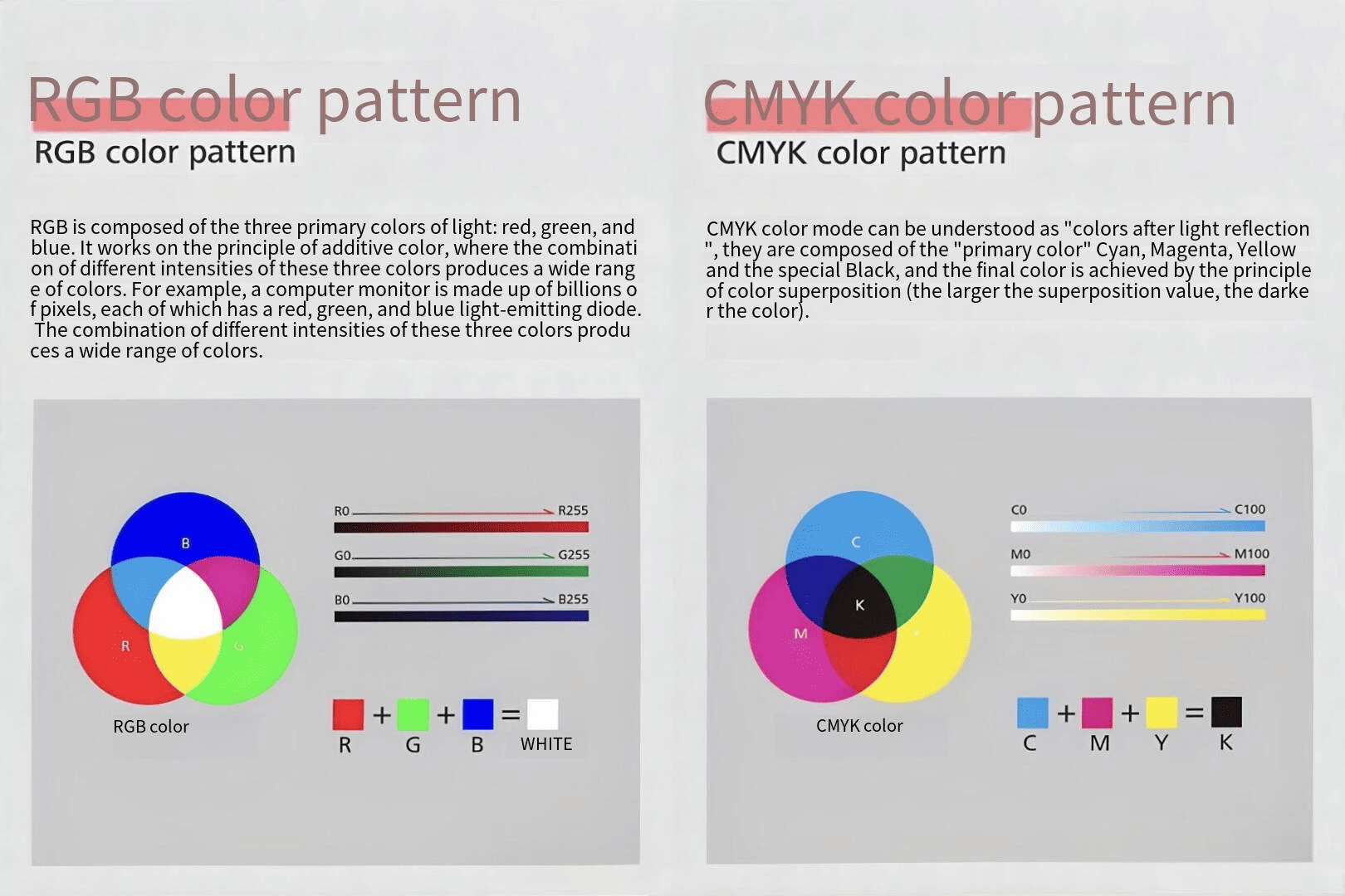
RGB is for screens (light). CMYK is for print (ink). They don't overlap perfectly, and that's where most color surprises come from.
What Is RGB and What Is CMYK?
RGB (Red, Green, Blue) is an additive color model — colors are created by combining light. Screens use this system, which is why RGB can display extremely bright, saturated colors that physical ink simply cannot reproduce.
CMYK (Cyan, Magenta, Yellow, Key/Black) is a subtractive color model — colors are created by layering ink on paper. The color range is narrower than RGB, but it's what commercial printers actually use.
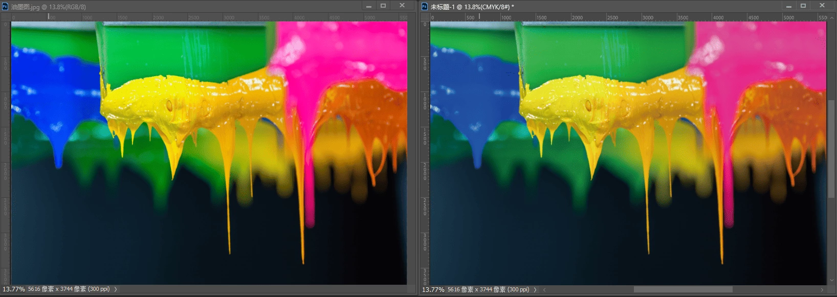
The practical difference: CMYK covers roughly 70–75% of the sRGB color space. That remaining 25–30% includes some of the most popular design choices — electric blues, neon greens, hot pinks — which are exactly the colors that cause the biggest surprises after printing.
What Happens If You Send RGB Files
Many designers work in RGB because that's Photoshop's default. If you send us RGB files, here's what actually happens in our production flow:
1. We convert your files to CMYK using our calibrated ICC profiles
2. Colors outside the CMYK gamut get mapped to the nearest printable equivalent — this is automatic and not always what you'd choose manually
3. You don't get to preview the conversion unless you request a digital proof first
In our experience, the most common complaints after conversion are:
• Blues shift toward purple — especially cobalt and electric blues
• Bright greens go muddy — they lose saturation and shift yellowish
• Neon anything becomes dull — there's no CMYK equivalent for neon
• Dark backgrounds look flatter — subtle gradients can collapse
Our recommendation: Convert to CMYK yourself before finalizing the design. This way you control the result, not the software.
The Colors That Cause the Most Problems
Based on hundreds of client projects we've produced, these are the colors that consistently cause issues when converting from RGB to CMYK:
| RGB Color | What Happens in CMYK | How to Adjust |
| Electric/cobalt blue | Shifts purple | Reduce magenta in the mix, check with CMYK preview |
| Bright teal/cyan | Loses saturation, shifts green | Pull back from the edge of the gamut |
| Neon green | Becomes dull olive | No fix — neon can't be printed in standard CMYK. Consider a Pantone spot color instead |
| Hot pink/magenta | Loses intensity | Add a bit more magenta and yellow to compensate |
| Rich black backgrounds | Can appear grayish or patchy | Use a "rich black" build (C60 M40 Y40 K100) instead of K100 only |
| Subtle gradients on dark backgrounds | Banding or collapse | Widen the gradient range, add noise texture |
Tip: In Photoshop, use View → Proof Colors (Ctrl/Cmd+Y) to simulate CMYK output while still working in RGB mode.
How to Prepare Your Card Artwork Files
These are the specifications we use for custom playing card production at Yuyoung:
| Setting | Requirement |
| Color mode | CMYK |
| Resolution | 300 DPI at final print size |
| File format | PDF (preferred), AI, or PSD |
| Bleed | 3 mm on all sides (standard poker: 69 × 99 mm with bleed = 72 × 102 mm) |
| Safe zone | Keep critical content 4 mm inside the trim line |
| Fonts | Outlined / converted to shapes |
| Color profile | Fogra39 (ISO 12647-2) or U.S. Web Coated (SWOP) v2 |
Card-specific notes:
• Front-back registration: Card fronts and backs are printed separately and aligned during cutting. Allow at least 2 mm tolerance — avoid borders thinner than 3 mm from the edge, as even slight misalignment becomes visible.
• Multiple card designs in one deck: Number your files clearly (e.g., card-front-01.pdf, card-back-common.pdf). This reduces production errors significantly.
• Dark or full-bleed designs: These are the most sensitive to color variation. Always request a physical proof.
Why Physical Proofs Are Non-Negotiable for Important Projects
A screen can only simulate CMYK output — and every screen displays color differently. A physical proof printed on your actual card stock shows you:
• True color on the real material — gray core, blue core, and black core stocks all absorb ink differently, which shifts color appearance
• Surface finish effect — matte lamination softens color, glossy film deepens it, linen texture diffuses fine details
• Gradient banding that isn't visible on screen but shows up clearly in print
• Registration accuracy — whether your border is truly centered after cutting
We strongly recommend physical proofs for:
• Decks with dark or black backgrounds
• Brand-critical color matching
• Gradient-heavy artwork
• Collector or premium editions
Card Stock and Its Effect on Color
This is something most guides ignore, but it matters a lot in practice:
| Card Stock | Color Behavior |
| Gray core | Absorbs more ink, colors may appear slightly darker and less vibrant. Best for bright designs where slight darkening is acceptable |
| Blue core | More neutral color reproduction than gray core. Good balance for most game types |
| Black core | Best opacity, but the dark inner layer can affect how you perceive color depth when holding cards against light. Color reproduction itself is similar to blue core |
| Art paper + premium core | The coated surface gives the most vivid, accurate color reproduction. Best choice when print quality is the top priority |
This is one reason the same design can look different on different card stocks — it's not just the ink, it's the interaction between ink, paper surface, and core material.
RGB vs CMYK for Different Card Products
| Product Type | Our Recommendation |
| Trading Card Games | CMYK + rich black for card backs + physical color proof |
| Tarot Cards | CMYK + art paper stock + physical sample (color accuracy is critical for tarot buyers) |
| Board Game Cards | CMYK + correct bleed + safe zone check (most rejected files fail on bleed, not color) |
| Collector / Premium Decks | CMYK + Pantone spot colors for brand-critical elements + proof on final stock |
| Educational Cards | CMYK + gray core is usually sufficient (color precision matters less than cost) |
Final Artwork Checklist
Before sending your files:
• ✅ Convert all artwork to CMYK
• ✅ Check colors with Proof Colors enabled — look for gamut warnings (the ⚠ triangle in Photoshop's color picker)
• ✅ Set resolution to 300 DPI at final size
• ✅ Add 3 mm bleed on all sides
• ✅ Keep text and key art 4 mm inside the trim line
• ✅ Outline all fonts
• ✅ Name files clearly with sequential numbering
• ✅ Confirm card stock and surface finish with your producer
• ✅ Request a physical proof if color accuracy matters