How to Choose the Right Paper Stock and Finish for Custom Tarot Cards
If you’ve ever held a mass-market tarot deck and then picked up a premium artisan deck, you know the difference isn’t just in the artwork—it’s in the hand feel, the weight, the way light interacts with the surface. For creators launching their own tarot line, getting the material choices right separates a deck that feels like a spiritual tool from one that feels like a cheap novelty. After 19 years of watching designers stumble through material decisions (and helping them course-correct), we’ve learned that most tarot creators underthink paper stock while overthinking box design. Let’s fix that.
Tarot cards face demands that standard playing cards don’t. The larger format—typically 2.75" × 4.75" or custom sizing—means more surface area to feel right in the hand. The intricate illustrations deserve better than the thin, flimsy stock that saturates the discount bin at gift shops. And the spiritual weight people assign to tarot means the tactile experience matters more than it would for, say, a poker deck you’ll toss in a drawer.
This guide cuts through the noise and gives you the manufacturing perspective you won’t find in design blogs. We’ll cover core material choices, surface finishes that actually matter, sizing and weight recommendations, premium add-ons worth considering, and the eco-trends shaping the industry in 2024. By the end, you’ll know exactly what to specify when you contact a tarot card printing specialist.
[Photo: A visual comparison showing the difference between a flimsy tarot card bending easily versus a premium card with proper spine flex]
Why Tarot Cards Need Different Treatment Than Standard Playing Cards
Here’s something we explain constantly to first-time clients: you can’t just ask for “playing card stock” and expect tarot-quality results.
Standard poker-size cards measure 2.5" × 3.5“—compact enough that minor material compromises go unnoticed. Tarot decks sprawl at 2.75” × 4.75" (or larger), which amplifies every flaw. A card that flexes awkwardly at 3.5 inches becomes a floppy disaster at 4.75 inches. Thinner stock that works fine for poker feels tissue-paper flimsy when you’re shuffling a 78-card tarot spread.
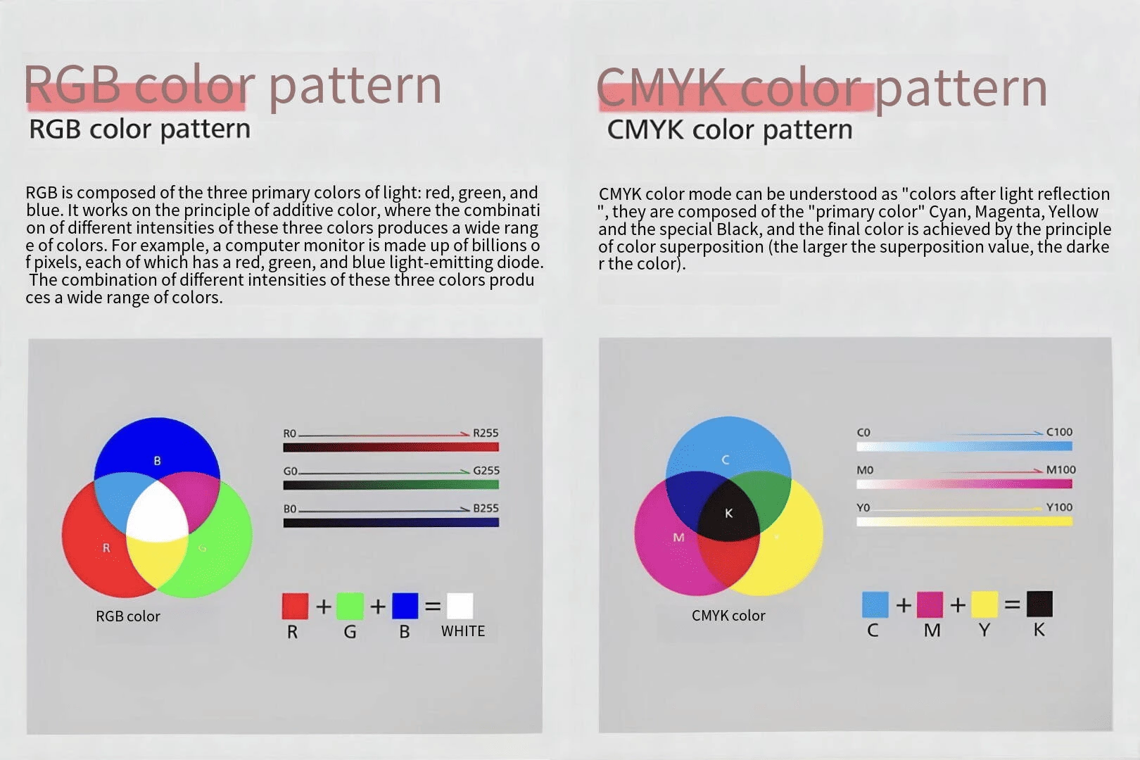
Then there’s the artwork consideration. Tarot illustrations aren’t random suits and pips—they’re detailed, often dark or moody imagery with fine linework. Standard CMYK printing on cheap stock turns rich purples into muddy grays and gold accents into dull yellow. Your illustrator spent months perfecting those gradients. The wrong paper stock can erase that work entirely.
We did a production run last year for a client whose entire Kickstarter campaign nearly collapsed because their sample deck—printed on standard 280gsm card stock—felt so flimsy that reviewers called it “like holding a paper cutout from a children’s craft box.” The fix wasn’t complicated (we switched them to 350gsm black core with linen finish), but they learned the hard way that material specs aren’t optional details. They’re the foundation of your deck’s identity.
[Photo: Side-by-side comparison of tarot card artwork quality on budget stock versus premium material, showing color vibrancy and detail clarity]
Core Material: Understanding Card Stock Construction
The Anatomy of a Quality Tarot Card
Before diving into options, let’s demystify what you’re actually choosing. A tarot card isn’t a single sheet of paper—it’s a sandwich:
- Core material: The inner body of the card, typically made from wood pulp or cotton blend
- Surface coating: The paper applied to both sides that receives the print
- Finish layer: Optional coatings (lamination, varnish) that protect and texture the surface
The core determines flexibility and durability. The surface coating affects how ink sits and how smoothly the card handles. The finish layer adds protection and tactile character.
Black Core vs. Blue Core vs. Gray Core: What Actually Matters
In our factory, we work with all three mainstream core materials. Here’s the unvarnished truth about each:
Black core is the gold standard for tarot and premium playing cards. The dark core prevents light from passing through even when you hold cards up to bright light—a crucial feature when shuffling spreads where partial transparency would destroy the aesthetic. Beyond functionality, black core cards have a satisfying snap and flex that heavier stocks enhance. When you bend a black core card for shuffling, it returns to flat cleanly. We recommend black core for most tarot projects, especially if your deck exceeds 78 cards or uses any transparency in the artwork.
Blue core sits in the middle ground. You’ll find it in mid-range card games and some board game components. The blue tint provides moderate light-blocking (noticeably less effective than black core, but better than gray). Flexibility is decent, though black core typically outperforms at equivalent weights. Cost-wise, blue core runs about 8-12% cheaper than black core, which adds up on 5,000+ deck orders. For budget-conscious creators with simpler artwork, blue core can work—just don’t expect it to perform like premium stock.
Gray core (sometimes called natural core) is the budget option that shows up in promotional decks, cheap card games, and mass-market products where cost reduction matters more than quality. Light passes through readily—you’ll see shadows, not darkness. The flexibility varies wildly depending on the surface coating. We’d only recommend gray core for single-use tarot decks, promotional giveaways, or when your budget literally cannot accommodate anything better.
For tarot specifically, here’s our take: don’t compromise on core material. Your audience will shuffle these cards hundreds of times. They’ll notice the difference between a card that blocks light and one that doesn’t. Black core isn’t just a preference—it’s the right choice for the format.
[Photo: Diagram showing the internal structure of black core card stock with labeled layers]
GSM and Thickness: What Numbers Actually Mean
GSM (grams per square meter) measures paper weight, not thickness directly. Two papers at 350gsm can feel completely different depending on composition—cotton fiber stock feels thicker and more substantial than wood pulp at the same weight.
For tarot cards, target these ranges:
| Size | Recommended GSM | Notes |
| Standard tarot (2.75" × 4.75") | 320-380gsm | Most versatile range |
| Large tarot (3.5" × 5.5") | 350-400gsm | Larger format needs extra stiffness |
| Mini tarot (2" × 3") | 280-320gsm | Smaller size allows lighter stock |
| Oversized display tarot | 400-450gsm | Decorative use, prioritizes rigidity |
Below 300gsm on standard tarot size? The cards will feel insubstantial. Above 400gsm? They’ll be difficult to shuffle and may not fit standard tuck boxes. The sweet spot for most projects lands at 350gsm—enough substance to feel premium without sacrificing usability.
We had a client insist on 420gsm for their “ultra-premium” line. The cards looked stunning. They also couldn’t shuffle without the deck cracking. We talked them down to 380gsm with black core and linen finish, and the feedback flipped from “impressive but unusable” to “the best feeling tarot I’ve ever used.”
Surface Finishes: The Details That Define Your Deck’s Character
Surface finish does more than protect your cards—it determines how your artwork looks, how the cards feel during shuffling, and what emotional response your deck evokes. Three main options dominate tarot production:
Matte Lamination: The Workhorse Choice
Matte lamination covers about 60% of our tarot orders. Here’s why it’s the default recommendation:
- Color rendering: Matte surfaces reduce glare and allow deeper color saturation, which benefits tarot’s moody palettes
- Writing compatibility: If your tarot design includes blank spaces for journaling or notes, matte surfaces accept pen ink cleanly (glossy surfaces smear)
- Shuffle feel: The slightly textured surface provides just enough grip without being rough
- Cost efficiency: Matte lamination adds minimal cost compared to specialty finishes
The main drawback is that matte lamination doesn’t enhance any special design elements. If you’re using holographic foils or metallic accents, matte will make them look subdued rather than popping.
Linen Finish: Texture That Elevates
Linen (sometimes called canvas finish) embosses a fabric-like pattern into the card surface. It became popular in premium playing cards and has migrated into tarot production as creators seek distinctive tactile experiences.
Linen finish excels at:
- Shuffle satisfaction: The texture creates micro-grip that makes cards feel like they want to stay organized during shuffles
- Premium perception: It signals craftsmanship without being ostentatious
- Fingerprint resistance: Matte surfaces show fingerprints on dark cards; linen texture disguises them
The tradeoff is color vibrancy. Linen texture slightly diffuses light hitting the surface, which can make colors appear 5-10% less saturated than they would on smooth matte. For dark, atmospheric tarot art, this might actually be desirable (it adds mystery). For bright, high-contrast designs, smooth matte may serve better.
We recommend linen for decks aiming at the “artisanal witchcraft” aesthetic—think muted tones, hand-drawn illustrations, vintage-inspired designs. It pairs exceptionally well with black core stock.
Foil Stamping and Edge Work: When Premium Meets Presentation
Foil borders and edge painting don’t change card stock characteristics—they’re surface treatments that add visual drama. For tarot, these options make sense when:
Foil stamping works best for borders, corner ornaments, or specific design elements. Full-card foil is visually overwhelming and expensive. Selective foil (gold sunburst on The Sun card, silver moon phases on The Moon) creates memorable moments. Budget roughly 15-25% cost increase for single-color foil stamping.
Gold/silver edge painting requires the cards to be cut before the edge treatment, which adds production complexity. The result is stunning—a deck that catches light when spread on a table. Costs vary significantly based on whether you want single-color edges or rainbow gradient effects. This treatment pairs naturally with the luxury tier we’ll discuss later.
One caveat: foil elements require careful file preparation. Make sure your designer understands how to specify foil areas in print-ready files—we’ve seen gorgeous designs ruined because the foil mask was created incorrectly.
[Photo: Close-up shots demonstrating the tactile difference between matte lamination, linen finish, and foil-stamped tarot cards]
Tarot Card Sizing: Matching Dimensions to Your Vision
While tarot decks have historical roots in standard European formats, modern custom production allows significant flexibility. Let’s break down the real-world options:
Standard Sizes and When to Use Them
Poker size (2.5" × 3.5") is technically smaller than traditional tarot but shows up in pocket tarot and mini decks. Not ideal for detailed illustrations but excellent for travel sets or budget-friendly starter decks.
Tarot standard (2.75" × 4.75") remains the most common format. This size accommodates detailed artwork while fitting in standard tarot bags and boxes. Most tarot-specific storage solutions assume this dimension.
Large tarot (3.5" × 5.5") creates a dramatic, display-worthy deck. Popular for limited editions, art-focused tarot, and ceremonial use where larger cards feel more significant. However, shipping costs increase and fewer third-party accessories exist.
Mini/Oracle hybrid (2" × 3" to 2.5" × 3.5") blurs the line between tarot and oracle cards. Many creators prefer this format for simplified, modern designs. Cards shuffle easily and storage is simple, but fine detail suffers.
Weight Adjustments by Size
As noted earlier, larger cards need stiffer stock to maintain proper shuffle feel. Use this as a starting point:
- Mini tarot (under 2.5" width): 280-300gsm
- Standard tarot (2.5" to 3" width): 320-360gsm
- Large tarot (3" to 4" width): 360-400gsm
- Oversized display tarot (4"+ width): 400-450gsm
These aren’t absolutes—actual feel depends on core material, finish, and personal preference. Always request material samples before committing to full production runs.
Premium Add-Ons Worth Considering
Sometimes the base card is just the foundation. Here are the upgrades that separate a nice tarot deck from an unforgettable one:
Gold and Silver Edge Cutting
Edge painting transforms how your deck presents when spread on a table. Instead of white or natural cardboard edges, gold, silver, or custom-colored edges catch ambient light and make your spread look like a ritual artifact.
This treatment requires:
- Cards printed and laminated
- Cards cut to final size
- Edge coating applied in dedicated machinery
- Final quality inspection
Turnaround adds 3-5 business days and costs 20-40% more than standard edge decks. For limited editions or premium pricing tiers, it’s often worth it.
Magnetic Closure Boxes
Standard tuck boxes work fine for tarot but lack the ceremony of opening. Magnetic closure boxes (sometimes called rigid setup boxes) provide a premium unboxing experience—think high-end jewelry packaging applied to cards.
Consider magnetic boxes when:
- Your retail price point exceeds $40
- You’re selling through boutique gift shops or galleries
- Limited edition runs where perceived value matters
- Gifting occasions where presentation is the point
For standard mass-market tarot, magnetic boxes add unnecessary cost. But for artisan decks with small print runs and premium positioning, they can justify higher price points.
Guidebook Printing
Many tarot decks ship with accompanying booklets. This adds complexity to your project but increases perceived value and provides space for interpretation guides, card listings, and artist statements.
Guidebook options include:
- Perfect bound: Clean, professional, suitable for 40+ page booklets
- Saddle stitched: Stapled, works for thin 8-16 page booklets
- Loose leaf insert: Cards and booklet in same box but separate
Paper weight for guidebooks typically runs 100-150gsm—lighter than card stock but substantial enough to feel quality. Cover stock should be 200-250gsm with matte or soft-touch lamination.
We handle integrated packaging and guidebook production regularly. The key is coordinating timelines—guidebook printing runs parallel to card production, and binding happens during final assembly.
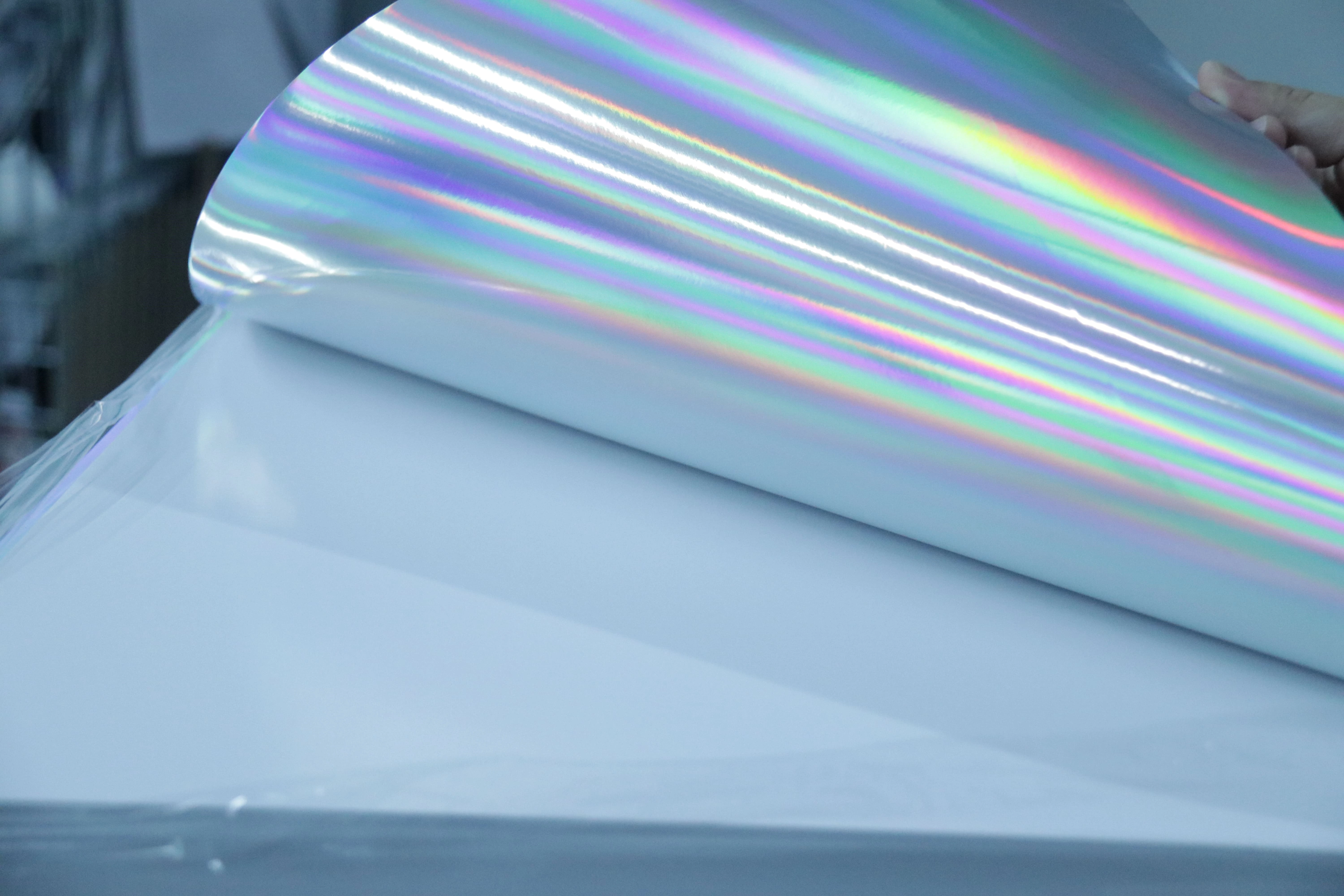
Holographic and Prismatic Effects
For creators seeking maximum visual drama, holographic card stock or spot UV effects create cards that shimmer and shift as they move. This works especially well for oracle decks or modern tarot interpretations.
Be aware that holographic effects can conflict with detailed illustration work—your art may get lost in the shimmer. Test carefully with printed samples before committing to full production.
[Photo: Examples of premium tarot packaging including magnetic closure boxes, gold-edge painted cards, and integrated guidebook printing]
Environmental Responsibility: The Eco-Friendly Shift in Card Manufacturing
Here’s a trend that’s accelerating: conscious creators want sustainable materials without sacrificing quality. We see it in every client consultation now.
FSC-Certified Paper Options
Forest Stewardship Council (FSC) certification ensures paper comes from responsibly managed forests. As an FSC-certified card manufacturer, we offer FSC-certified options across most paper grades. The quality difference is negligible—responsibly managed forests produce excellent fiber.
FSC certification matters to European buyers especially, where retail chains increasingly require documented sustainable sourcing. If you’re targeting premium gift shops, holistic wellness brands, or eco-conscious demographics, FSC certification becomes a marketing advantage.
Cost impact is typically 5-10% above standard stock. For small runs, the premium is manageable. For large orders (10,000+ decks), the percentage narrows considerably.
Soy-Based Inks and Reduced VOC Processes
Traditional petroleum-based inks release volatile organic compounds (VOCs) during printing. Soy-based alternatives reduce VOC emissions by 60-80% while producing equally vibrant colors. Most of our standard production now uses soy-blend inks by default.
Water-based coating options further reduce environmental impact. These changes don’t affect card quality—your tarot deck performs identically whether printed with soy or petroleum inks—but they align with values-driven purchasing decisions.
Recycled Content Options
Recycled paper stocks have improved dramatically over the past decade. Modern recycled cards don’t show the flecks or inconsistent coloration that early recycled products displayed. For tarot with dark, atmospheric designs, recycled stock with 30-50% post-consumer content works beautifully.
The main consideration is consistency. Recycled stocks vary more between batches than virgin fiber papers. We recommend extended sampling before committing to recycled for large production runs.
Making the Case for Sustainability
Here’s the business reality: eco-friendly tarot decks command premium positioning. Studies consistently show that environmentally conscious consumers accept 10-20% price premiums for verified sustainable products. Your material choices become part of your brand story.
For Kickstarter campaigns, sustainability messaging resonates strongly. “This deck is printed on FSC-certified stock with soy-based inks in a carbon-neutral facility” tells backers you’re serious about values alignment, not just chasing aesthetics.
We document our environmental processes thoroughly because creators need that documentation for their own marketing. If sustainability is part of your brand positioning, ask your manufacturer about certification documentation.
[Photo: Examples of eco-friendly tarot packaging including recycled paper tuck boxes and soy-ink printed cards]
Common Mistakes to Avoid
Before you finalize your material specifications, learn from others who’ve walked this path:
Mistake 1: Prioritizing box over cards. We’ve seen creators obsess over magnetic closure boxes and premium foil stamping on packaging while skimping on card stock. Your customers interact with cards hundreds of times. They open the box once. Invest in card quality first.
Mistake 2: Skipping material samples. Material choices feel abstract until you hold them. Always request physical samples before production. We provide sample kits with multiple stock and finish options for exactly this reason.
Mistake 3: Ignoring artwork resolution requirements. Larger tarot formats need higher resolution artwork—300 DPI is the minimum, and 400 DPI for premium detail. A gorgeous design rendered at 72 DPI will look muddy on a 4.75" × 5.5" card.
Mistake 4: Underestimating shuffle testing. Before finalizing stock specifications, shuffle your sample deck 50+ times. Cards that feel great initially may develop issues (delamination, edge wear, core separation) after repeated use. We test all production runs for shuffle durability; you should test your samples similarly.
Mistake 5: Forgetting about international shipping. If your tarot deck exceeds 350gsm with premium finishes and rigid packaging, shipping costs can exceed your product cost. Balance premium positioning against practical logistics. Sometimes the best choice is slightly less premium material that allows reasonable shipping.
Finding Your Manufacturer: Questions to Ask
Material specifications mean nothing without a manufacturer who executes them precisely. When evaluating partners for your custom card games production, ask these questions:
- What’s your typical tolerance for card thickness within a production run? Consistency matters—cards should feel identical across the deck.
- Do you provide material samples before production? If not, walk away.
- What quality control processes exist? Look for documented inspection procedures, not just visual checks.
- Can you provide FSC certification documentation? If sustainability matters to your brand, verify certification scope.
- What’s your typical waste percentage on tarot production? Experienced manufacturers have optimized processes; high waste indicates poor process control.
- Do you offer design file preparation assistance? Artwork files frequently require adjustments before they print correctly. Manufacturers who help with file prep prevent costly errors.
Our factory in Shenzhen has produced tarot and oracle decks for clients ranging from indie creators with 200-deck Kickstarter campaigns to established brands ordering 50,000+ units. The principles don’t change—material quality, production consistency, honest communication. What changes is the scale of support we provide to match your project size.
Bringing It All Together
Choosing paper stock and finishes for custom tarot cards isn’t just a technical decision—it’s an expression of what you want your deck to mean to the people who use it. A fortune-teller laying out a Celtic Cross spread deserves cards that feel substantial and block light completely. An oracle deck meant for daily meditation benefits from surface textures that invite touch. A limited edition art tarot should look and feel like a collector’s object.
Start with black core stock for any serious tarot project. Choose your surface finish based on how your artwork will interact with texture—linen for atmospheric mystery, matte for vivid color, foil accents for selective drama. Don’t overengineer the weight; 350gsm handles most standard tarot sizes beautifully. Consider premium treatments (edge painting, magnetic boxes) only when your positioning supports the price point.
Most importantly, get samples in your hands before committing. No article or specification sheet replaces the tactile experience of shuffling a deck yourself.
If you’re ready to move from material planning to production, our team handles everything from design consultation through finished decks. We’ve guided hundreds of tarot creators from concept to shipping, and we know which material combinations work for specific project types. Reach out for a material sample kit or production consultation—we’ll help you find the right balance of quality, cost, and timeline for your vision.